Reimagining the USMNT World Cup Kits

After an eight-year wait, the release of the USMNT World Cup jerseys left many fans across the country disappointed. The uniforms will be worn by the USMNT in Qatar and by the USWNT ahead of the 2023 World Cup, but the response hasn’t been all that great. In an effort to mend the wound, many designers have come forward with their own concepts for what could have been. Recently, we caught up with creator Jordan Collins to reimagine the national team kits in ten different ways.
What were your first thoughts when you saw the release of these new kits?
I was caught off guard, to be honest. I had seen the leaks, and I wanted to believe it was just an early concept from the beginning of the design process. Seeing it be the final product was a bit surprising on my end.
How do you feel about everything that’s been said surrounding the release and the messaging around the kits?
A lot of the stuff that has been said to defend it has been a bit tone-deaf, in my opinion. A lot of what we’re hearing now is that they’re just teeing us up for 2026. Even if you do buy into that explanation, it’s still such a missed opportunity. In the release, they mention “youthful and vibrant” quite a lot, but the final product almost screams the opposite. The away kit does have some of that, though, but the home kit couldn’t be more conservative.
What do you think of some of the subtle design choices made? Nike did mention they tried to include a few nods to sports culture here in the US.
Yeah, they say the company’s logos are on each sleeve rather than the right breast in order to reflect American football jerseys. The US crest is then akin to a basketball jersey because it’s centered in the middle of the chest, and the shoulder and sleeve seams are supposed to resemble those found in a hockey uniform. That’s a bit disappointing because I’m here to watch soccer. It’s the World Cup. Why would I want to talk about other sports, and for that matter, borrow their own concepts for our own home jersey? It doesn’t make much sense to me.
I think many of us do feel disappointed by most of those choices, to be honest. But I guess we don’t have to dwell on all of that. Tell me about the inspiration behind this kit-concept project you embarked on relating to the USMNT. What drove you to start?
For me, it was just knowing that there are options out there. There are a ton of talented kit designers out there, and there are some great third-party brands that are doing cool things and actually listening to input from fans. That was definitely an inspiration for me to do this project. The other inspiration was the kit history of the United States. When you look back, there are a lot of good concepts that have come and gone through the years. There are a lot of cool pinstripe jerseys, a lot of hoops, a lot of varied color palettes, and great ideas that we can draw from and modernize. It’s not about remaking, but remixing. What’s more “youth and vibrant” than taking something that is already known and loved, reimagining it, and making it something new?
How about your process for designing these concept kits? How did you do it?
It really came down to doing a lot of research and spending time with individual elements from kits of the past. I would pull all of these old designs into Illustrator and just break them down into smaller pieces and down to the smallest details. It almost gets to the point where those elements don’t even feel USA anymore – just a star over here and a stripe over there. From there, I’ll just start combining different elements in various ways. I go completely in one direction one day, and then a couple of days later, I look back and try to go the complete opposite way. At one point, you just hit a flow state, and it’s like all of the ingredients come together in the way you feel is right. That's why I think it’s cool that you can have different people working with the same brief but arriving at completely different results.
What do you hope people will take from this project?
If there’s one thing I would hope to get across is that I’m trying to keep the good things from the old and introduce new elements. I have no intention of just riding on the ideas of the past 50 years without adding anything original to them. The big thing I want to get across is that we do have soccer history. We do have substantial kit history, and those things should be at the forefront of what we’re doing. I hope when people see these designs, they do see that I tried to take something from the past but also broke some new ground to reintroduce these ideas in a fresh way.
The Sash Kit
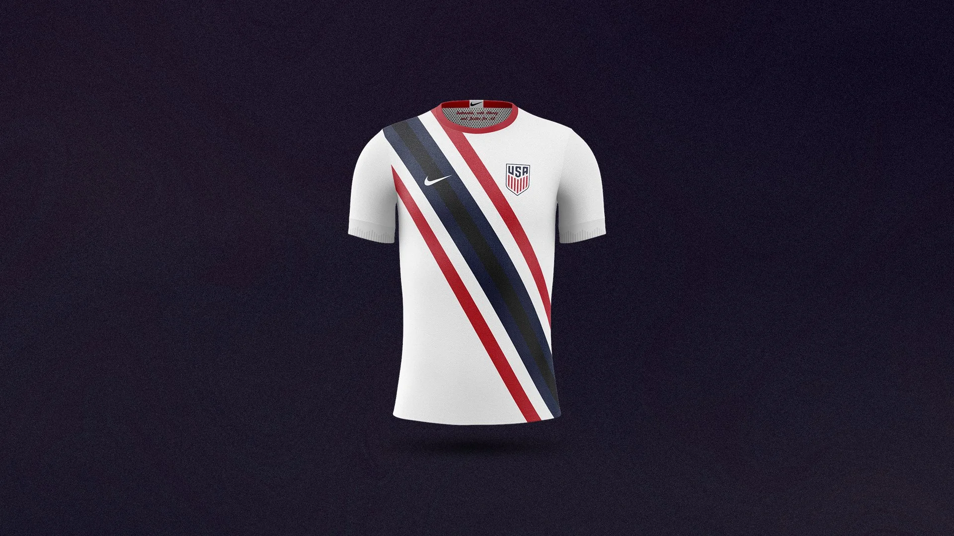
As I was doing research, I realized there are a ton of US jerseys that feature a sash. They were really popular at the beginning of the 2010s, but we even had a USMNT jersey from the 1950s that featured a sash. I wanted to use this timeless feature but remix it a little.
I wanted to keep the base color white but do something a bit different with the sash. I decided to make it multicolored, and feature the classic red, white, and blue, but with different tones. I darkened the navy blue a little bit more at the center just to add a little bit of a twist and contrast. I also wanted to connect the sash with the collar, just to make sure all of the primary elements of the kit are balanced.
The Waldo 10th Anniversary Remix
I almost felt a little bit guilty including this one. It’s essentially the Waldo Kit but with another pattern underneath. The red pattern is actually a variation of the crest cut up into a bunch of pieces, which gives the design a different type of texture. I wanted to do something that was akin to a legendary design but tweak it slightly. For the red pattern, I drew inspiration from the tablecloth Manchester United kit that Robin van Persie wore when they last won the Premier League. This one was for everyone who loved the hoops of the Waldo kit but wanted a slight update.
The 4th of July Red
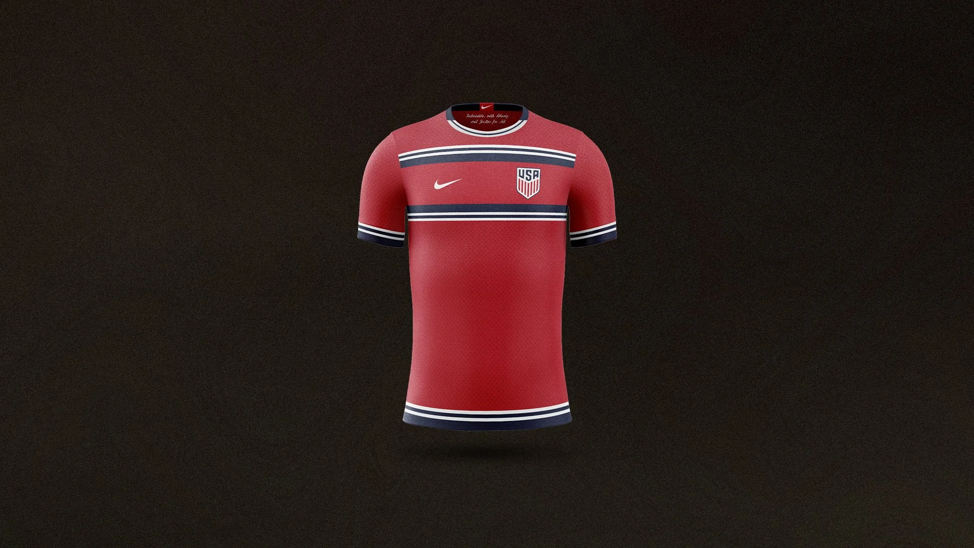
Looking back at our history, we have so many red kits – the 2019 Gold Cup one, the 2017 third kit, 2011 away kit, and so on. I wanted to take that color and keep it simple, sort of going with this year’s approach of, ‘here’s something classic.’ I wanted to make something that was just straight down the middle but that people would still enjoy.
On top of that red base, I wanted to have those blue and white bands play off of each other. Once you add the same element across multiple parts of a jersey, it becomes less about the element and more about the relationship between them and their placement. I wanted the shirt to be about the relationship between the collar, the cuffs, and the center portion of the chest. It’s all about those elements combining into something that’s super clean that anyone could wear on the 4th of July, not just a soccer game.
The Gotham Kit
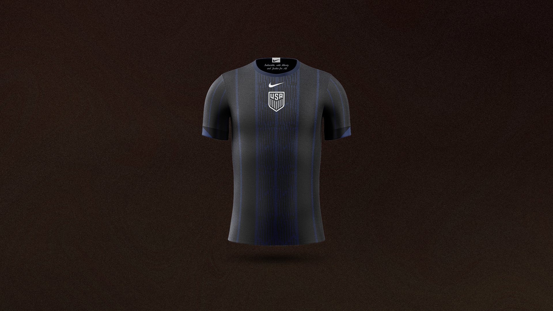
If Batman had a soccer jersey, this is what it would be. It’s super dark, and then it has touches of navy throughout. I wanted to do something for a third kit that hadn’t really been done before. In the past, there have definitely been ones that have been really dark or gray, but I wanted to have my take on that.
In terms of the overall layout, I wanted to go with something that was center-aligned because those types of kits are definitely a hot topic right now. I also kept the badge monochrome so that it would pop against the dark background and create a highlight that people might really enjoy. Then, I kept the vertical navy pinstripes very symmetrical so they would support the center-aligned design. For this one, I just wanted to go totally outside of what we’ve done before. It’s also like when Spider-Man gets his black suit.
The Pinstriped
This one is a redo of the 2008 kit. I wanted to change up a few things from that design. First, I didn’t love the V-neck collar of that kit, so I tweaked that for this design. The other thing was that the panels going up the pinstripes alternated between white and light grey. I loved the pinstripes from it, but I wanted to cross that concept with something a little cleaner and understated that could stand as a home jersey. I decided to keep the pinstripes and have white be the dominant color going up each of the panels. It wasn’t about reinventing the wheel with this one, but I wanted to show that we could still remix a few things from previous kits and still have something that could be cool and fun.
The Forever ‘96
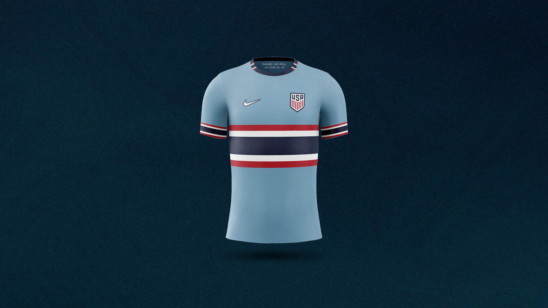
For this one, I wanted to expand our vocabulary a little bit. There are so many red, white, and blue kits, but this light blue one was inspired by the 1996 third kit. I didn’t deviate too much from that design other than removing the polo collar and tweaking a few minor details. The horizontal stripe in the center is exactly like in 1996, except it doesn’t have the break in the middle with the crest in between. I just wanted to modernize it a little bit, and also expand a few details on the sleeves. The main goal, though, was to reintroduce the light blue into the palette, and also bring back the center stripe, which has been featured in a lot of kits over the years.
We’ve kind of sat within a box of white home kit and a dark blue away kit for so long, that maybe we should start to look back at our history for other options. I feel like we’ve weirdly gone in a super conservative direction where we don’t wanna make anyone mad, and that’s making people mad.
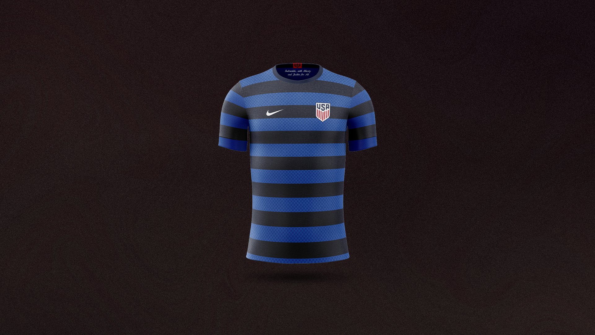
The Waldo Duotone
I’ve loved the use of blue in the away jerseys over the past decade. I took two of the different blues that we had been using in recent years and put them together in a hoop design. I wanted to keep it really simple, but I also made slight tweaks. I put a dot pattern over the lighter blue to add a little bit of texture. I drew inspiration from those old Puma jerseys from the ’06 World Cup, where the kit could be super plain, but the texture within the colors would reveal an additional design. But for this one, I wanted to do something clean and stripped down that could still work.
The New Denim
This one is building on the 1994 World Cup shirt. I added a lot of textures to this one to try to make it feel like denim. I don’t think the players would be down to play in denim, so it was all about replicating that look in a modern way. You can see hints of light blue within the stars, and more textures have been added to make it different and bring this iconic design into 2022. You don’t need to copy classic designs to a T, but we can bring some things back with a twist if we want to be youthful and vibrant. The great thing about American culture is that it’s a melting pot. Let’s bring up old things that we have and make them new for this generation.
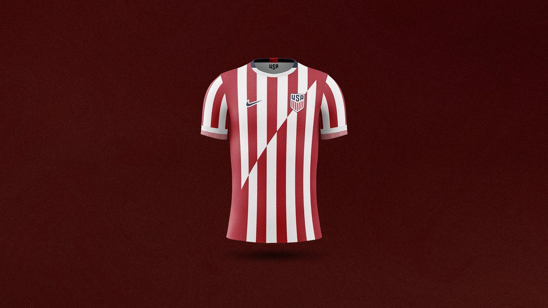
The Atletico USA Kit
I tried to connect contemporary Nike designs with things we’d seen in the past from the USMNT. Nike has been putting the lightning bolt trim on their sleeves for the past couple of years, and I wanted to blow that up and connect it with the stripe patterns that we’ve seen the US pull off. The white kit with vertical red stripes has been done many times, so it was all about giving it a twist. I drew from the wavy vertical stripes we saw in ’94, but I mixed them with the lightning bolt design that Nike has been using for their sleeve patterns. Again, it’s about finding ways to bridge the old with the new, even if it is ultimately a classic white kit with red vertical stripes and blue accents.
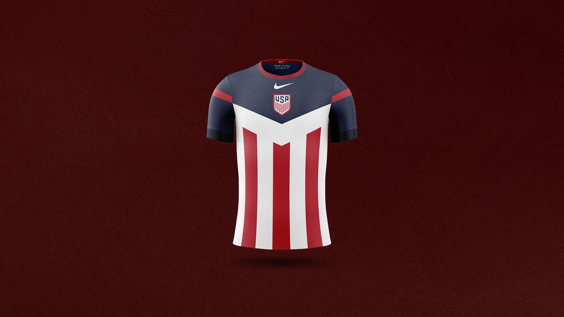
The Captain America
I feel like this one really designed itself. The nods to Captain America are supposed to be obvious. I was trying to show that we can take simple things from our flag or our culture and make them into something cool related to soccer. A few years ago, I saw Under Armor put out a few shirts that had superhero designs, and I remember seeing some Sunday league goalkeepers wearing them. Back then, I thought it looked really gaudy, but I wanted to take that type of concept and see if I could make it into something that a pro would wear on the field, and that any person could wear on a regular day. It was about making something that could kind of hit everybody.
‘With Liberty and Justice for All’
I chose to include that tagline across all the collars in this collection. The US release spoke of youthful and vibrant American culture. To me, that’s represented perfectly by the diversity of our team. The players you see on the team are a reflection of the diversity in our country, so I thought it was important to put a reference to that on the collar. I thought it was a simple way to include a nice little detail that calls back to our history and embraces our diversity. It helps tie these concept kits together and also embraces the inclusion we want to see in our country and on the field.
